Tom Bubul .info
tom.bubul@gmail, @tombubul. Last updated 7/10/18: Initial post
Thoughts on a promo postcard for a local rendition of "A Midsummer Night's Dream"
Intro
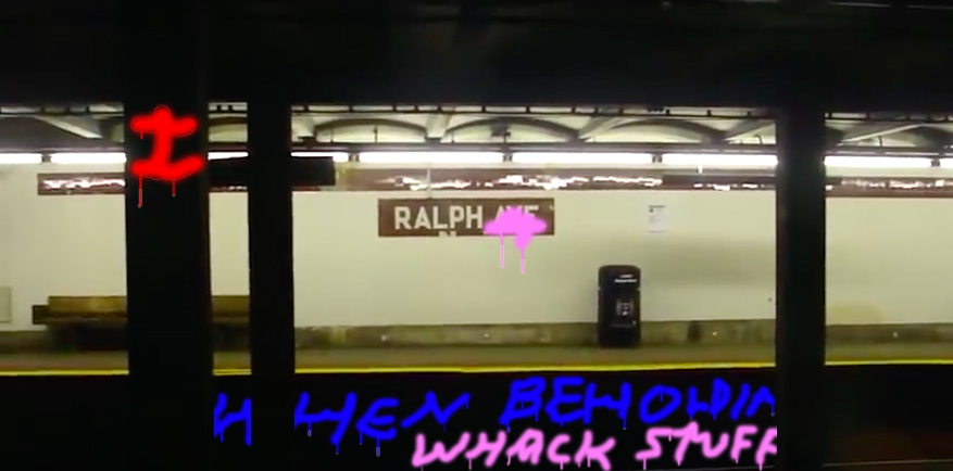
I saw this postcard for smith street theater's july 2018 performance of shakespeare "a midsummer night's dream" (first published 1600) in carroll park, near where I buy organic broccoli, and it caused me to have some thoughts:
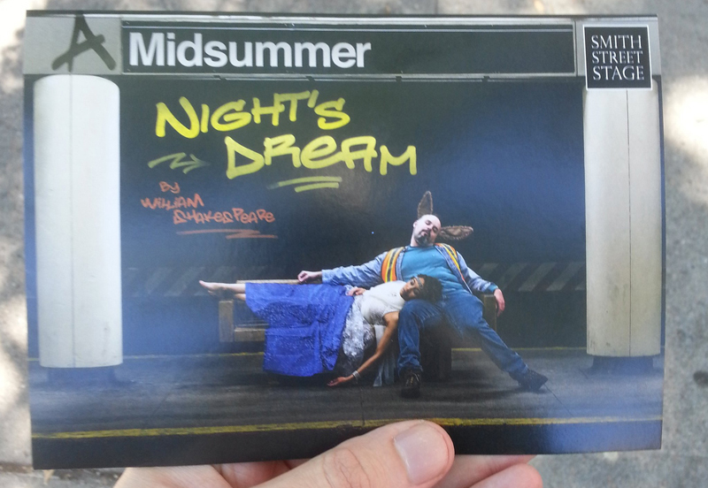
- So to start, "Midsummer" in Helvetica in white on a black background at top here reliably communicates "present-day NYC subway platform" because this Helvetica treatment is made iconic by its ubiquitousness on irl subway platforms.
- Helvetica's power to indicate scene is reinforced by the foreground "yellow line," commonly denoting "platform edge," and the background band containing 45 degree red and white stripes, indicating caution for lack of lateral clearance between the wall and oncoming trains.
- Basic intro point being = we can obviously see that design gestures communicate context and meaning.
- And while "barefoot woman, wearing clean clothes, touching the subway platform with her hand, lying across a subway bench (that's designed to be difficult to lie across), with her head on a worker's lap, and the worker is wearing donkey ears, and neither of them look perturbed or uncomfortable" is an improbable setup, NYC is 100% capable of randomly generating this scene, and in fact probably has many times, so I have nothing else to say abt it.
- And I don't have any feelings abt shakespeare either way[1].
- So, this is a post abt graffiti. :)
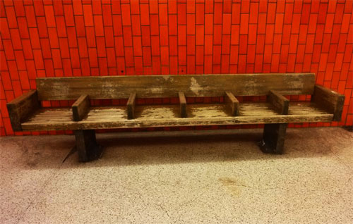
It's good to do your thing
- Honoring, extending, or flipping a tradition in a fun way is core to a lot of creative work. And I'm aware (via Baz Luhrman "Romeo + Juliet" (1996)) that "modern restaging of shakespeare" is one thing theater companies do.
- I think the idea of these "modern restagings" is that the power and authenticity of the language can still communicate something to "audiences today" thru performance, but that it might be easier for some audiences to take an interest in that language if the production design itself is something they can readily recognize, when the language itself is not[2].
- Doing the work of being an ambassador for your creative tradition by actively trying to present it in a simple and recognizable way to new audiences is, I think, cool and good - I'm not hating on this. If like one 8 year old kid sees this play in carroll park and then goes down a theater rabbit hole or whatever, great, another life saved.
- And I get that not everything needs to be "good" and that "the quality of the production design" doesn't even really matter here - that what matters is enabling a basic community encounter with theater.
- None of this is super far away from my own studio, where my own starting premise might read "I think it might be possible to make new paintings that could have some interest or value to some person or community in 2018 (tho painting's accessibility is a concern I have to account for)."
And yet, a hypothetical
- Let's say I were to install a mural in carroll park designed to make painting seem cool and interesting and accessible to the community.
- To do that, I include elements of a shakespeare play in the mural, because I understand that there's a rich local history of staging shakespeare in the park.
- But because I personally don't know anything abt shakespeare and only see shakespeare as a shorthand for "something you would recognize as something you've maybe seen in the park," I organize my shakespeare material in a way that presents as shockingly & unironically bad to anyone concerned with shakespeare.
- Resultingly, the mural is offensive to those community members for whom shakespeare characters "mean" something - I flattened the material from their world into a caricature, and didn't capture what's cool and interesting abt that material in the process.
- I imagine those shakespeare-loving park-dwellers would regard my mural as bad and dumb, and no proof at all of the possibility of painting to transform a community space, and certainly no proof of my own capacity as a painter. They'd see it as a flattened caricature of painting as an oblivious form - proof of how pointless and what a waste of time painters and perhaps all living artists are to everyone. They'd definitely be mad that, at some point, somebody paid me or gave me permission.
- Thus we can see that it would be irresponsible for me to use shakespeare characters in an oblivious way like this in my hypothetical mural in carroll park, because I want the people who see this mural to like it, and I want the mural to be a worthy ambassador for painting as a form, there in the community space.
- In another hypothetical, I paint a mural that doesn't include shakespeare characters. It just sticks to the rich, living, local traditions I know about, and renders them to the best of my basic ability. Some eight year old likes it, and great, we all live on.
I just love to crush shit - fucking destroy
- Graffiti has a mega deep and rich history, especially in new york (and nearby in philly, where I became an adult). I'm just a bystander :), but as an artist who uses line and letterforms, I've learned so, so, so much from it.
- The postcard for this theater performance depicts the "tag" "Night's Dream" and then the "tagline" "by william shakespeare" (and a little bit of flair), as if written on a subway train tunnel wall with aerosol paint. This doesn't work on a formal level, let alone an aesthetic one.
- The imagining of "graffiti letters" in the postcard's tag is based, to my eye, on fat cap tags. Fat caps are literally a cap you put on your paint can that give a wider paint dispersal on spray application. With decent can control - proper spray control and wrist action working in conjunction with broader arm motion, and consistent and proper/intentional distance from a surface[3] - you can do some interesting stuff with a fat cap, including fades and sharp variations in line. Results will vary times one million but consider e.g. https://www.youtube.com/watch?v=GrT_mlzXosg
- So while you have a basic fat cap line here, it's pretty sus that there would be no variation in line diameter or hardness.
And is this digital gradient?
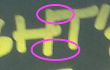
And is this a digital stroke added for "legibility"???
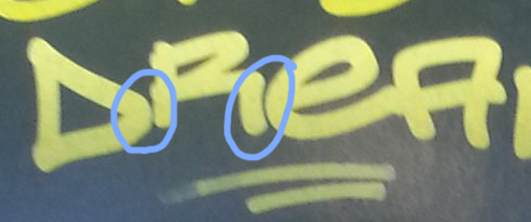
- And a tag is a name; a tagline is the funny bonus material. The postcard gets this most basic premise backward.
- And the "by" in the tagline is redundant; the tag itself is the "by."
- To more clearly illustrate, let's turn to some game footage.
Here's enem's daytime intro to handstyles, which I link at all opportunities https://youtu.be/u8U-8pDUYhs?t=1m52s
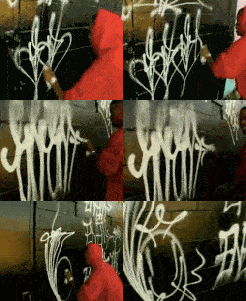
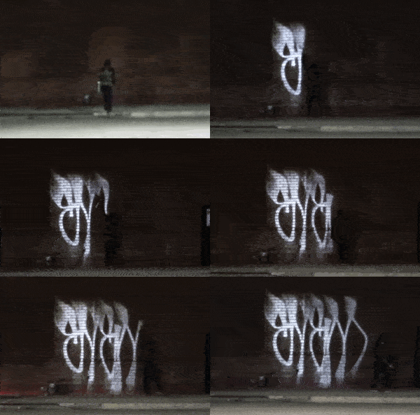
Here he is at night https://www.youtube.com/watch?v=4p7Pgy0Xzfc
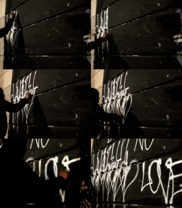
Here's a sample from the current generation https://www.youtube.com/watch?v=UJe0FQZgAcM; compare the WACKO crossed-out hearts NO LOVE at 4:30 with the hearts in the enem handstyles vid. PURE PHILADELPHIA -
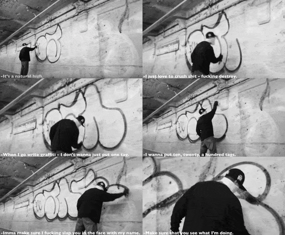
Here's a nice vid of og ojae here in nyc, in his 40s, talking thru his relationship with the game https://www.youtube.com/watch?v=3LrnAHpEGNI
In conclusion, here are those cornball swaggerless steve buscemi "greetings fellow kids" postcard letters one more time:

I believe it was the late-16th century philosopher DJ Khaled who said, "congratulations, you played yourself."
I don't think graffiti people are abt to get up in arms abt this postcard, but imagine if the unthinking design gesture here affected a community with more at stake?
footnotes
- [1] other than a general dislike/distrust for the space and resources "big canonical genius" brands continue to take up. Midsummer Night's Dream is 418 years old at time of posting, to which I say, Support Living Artists, Produce Works By Living Artists, Be Interested in Living Artists [back up]
- [2] Irresistable Luhrman R+J aside = I love when the contortions of this process produce results that're fully beyond either the intended meaning of the original text OR the minimum viable requirements of "recognizability" in production design. The one I think abt all the time is the aggressively winking recasting of "longsword" from "sword" to "gun": https://getyarn.io/yarn-clip/373a19b2-30d4-4de7-8503-f9edfd6a2e80 [back up]
- [3] at least as difficult for a pedestrian as rendering a half-decent shakespeare performance [back up]
Home